DevTools Panel
The DevTools panel is the advanced workspace where you can inspect, preview, and edit SVG components in real time—without leaving Visual Studio Code.
It is designed to help you:
- Visually validate icons before using them
- Experiment with props and styles
- Inspect component metadata and structure
🧠 DevTools Overview
The DevTools panel is divided into two main sections:
- Playground — Interactive editor and live preview
- Component Info — Read-only metadata about the selected icon
Each section updates automatically when you select a different component.
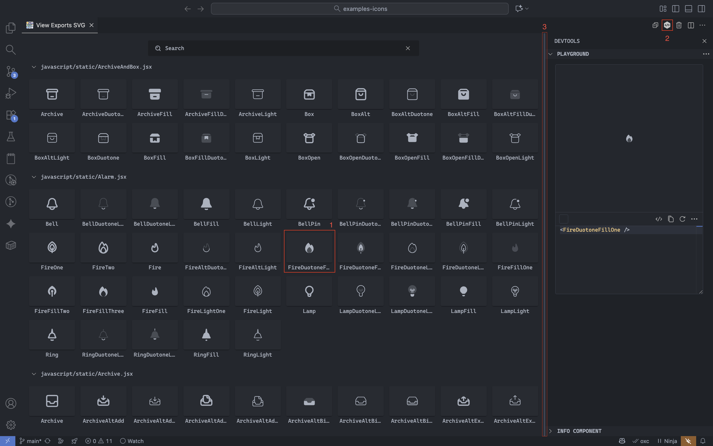
🧩 Playground
The Playground lets you experiment with SVG components dynamically. It combines a live preview, a real-time code editor, and quick-access actions.
✏️ Real-time Editing
Use the built-in editor to modify your component props. All changes are reflected instantly in the preview.
Editing the <Dribbble /> component live in the Playground editor.
Pro tip
The editor includes autocomplete and contextual suggestions. You can see them by typing the name
of a property inside the component or by opening the < symbol to show suggestions for all
components.
⚡ Quick Editor Actions
The editor toolbar provides quick access to common actions:
- Show / Hide code — Toggle editor visibility
- Copy code — Copy the current editor content
- Reset code — Restore the initial state
Additional actions are available under the More actions menu:
- Open in Editor
- Copy as SVG / PNG
- Download as SVG / PNG
🎨 Background & Contrast Testing
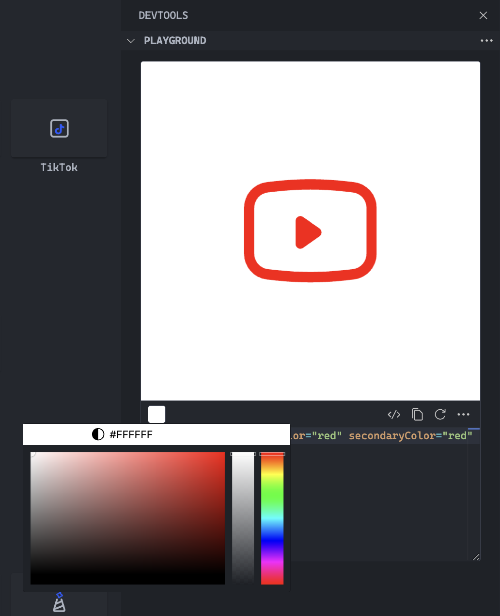
Use the color picker to set a custom background color for the playground. This is especially useful when working with icons that have transparent or semi-transparent elements.
In addition to those scenarios, it's also useful for testing different color combinations and contrast levels.
🧰 Playground Menu Actions
At the top-right of the Playground, you'll find an actions menu (three dots icon) for managing the environment.
The menu includes the following options:
- Reload Playground — Resets the preview and editor.
- Enable Word Wrap — Toggles line wrapping in the editor.
- Reload Editor — Rebuilds the code editor.
ℹ️ Component Info
The Component Info section displays read-only metadata about the selected icon.
| Field | Description |
|---|---|
| Component name | The exported name of the icon component. |
| Type declaration | Whether it's defined as a variable or function. |
| Is exported? | Indicates if the component is publicly exported. |
| Is animated? | Detects motion or animation within the SVG. |
| Is favorite? | Shows whether it's marked as favorite. |
note
This section is informational only and updates automatically when you select another component.
📍 DevTools Location in the UI
You can open the DevTools panel in several ways:
- Click an icon card
- Use the top-right toggle button
- Drag from the right edge to dock or undock